Overview
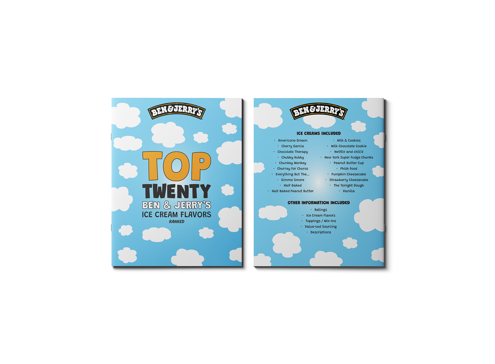
This project involved designing a letter-sized, 20-page booklet showcasing a range of ice cream flavors from Ben & Jerry’s. The objective was to create a consistent, repeatable layout system that could effectively present detailed product information across multiple pages while maintaining visual cohesion.
Challenge
The primary challenge was creating a structured layout that could accommodate varying content while remaining visually consistent. Each flavor included different combinations of descriptions, ratings, ingredients, and available imagery, requiring flexibility within a fixed design system.
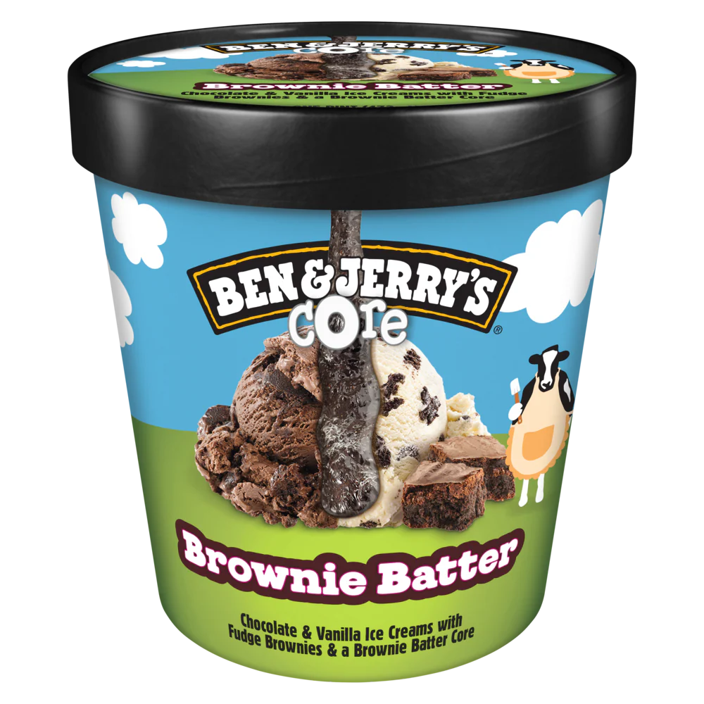
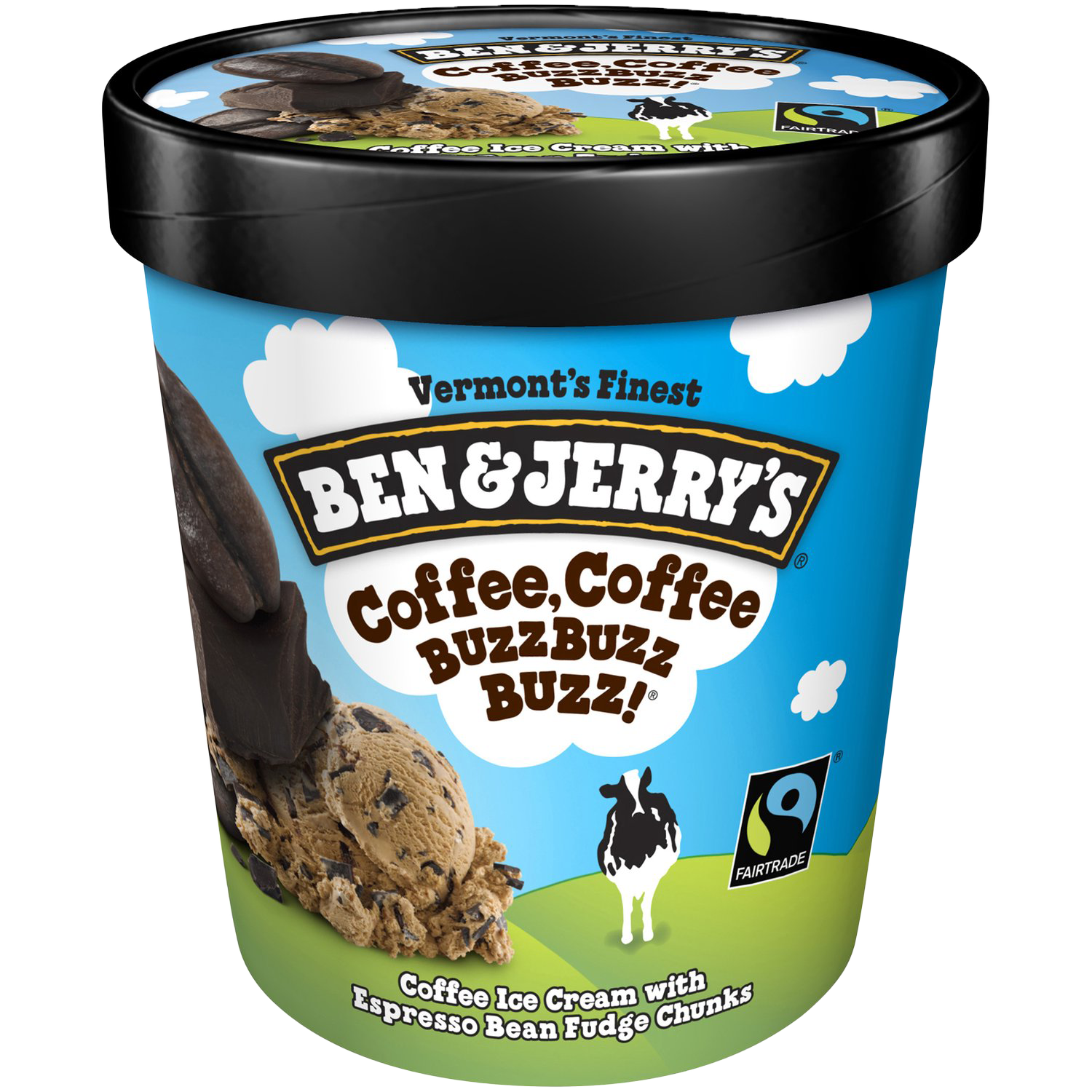
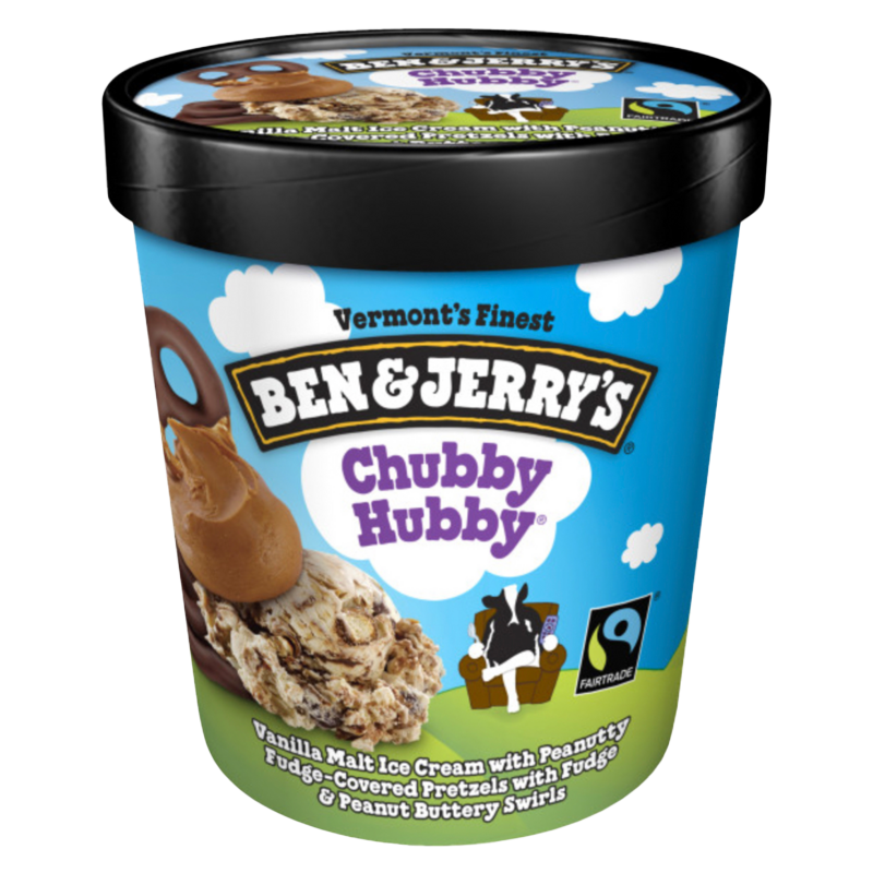
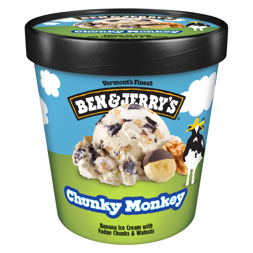
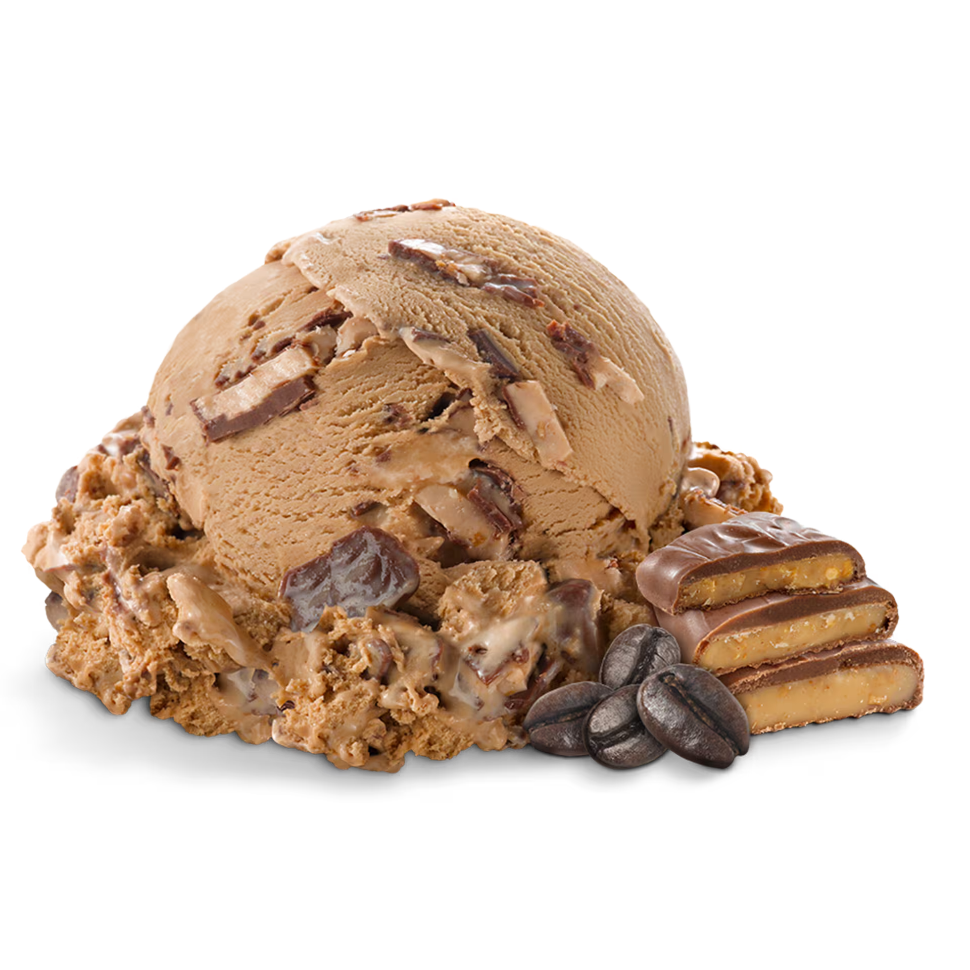
Sourcing consistent, high-quality images for each flavor also presented limitations, influencing how content was structured and displayed.


Process
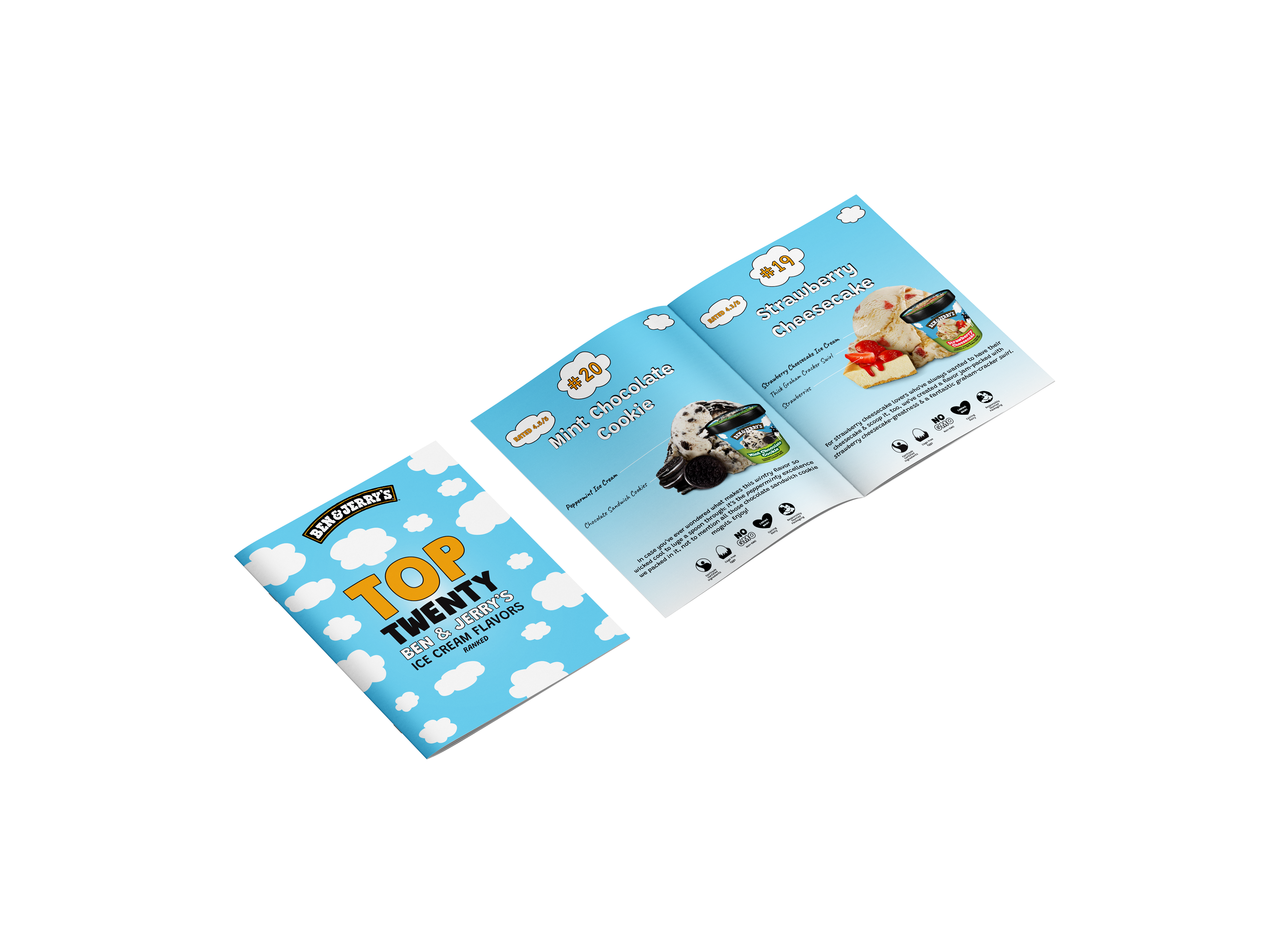
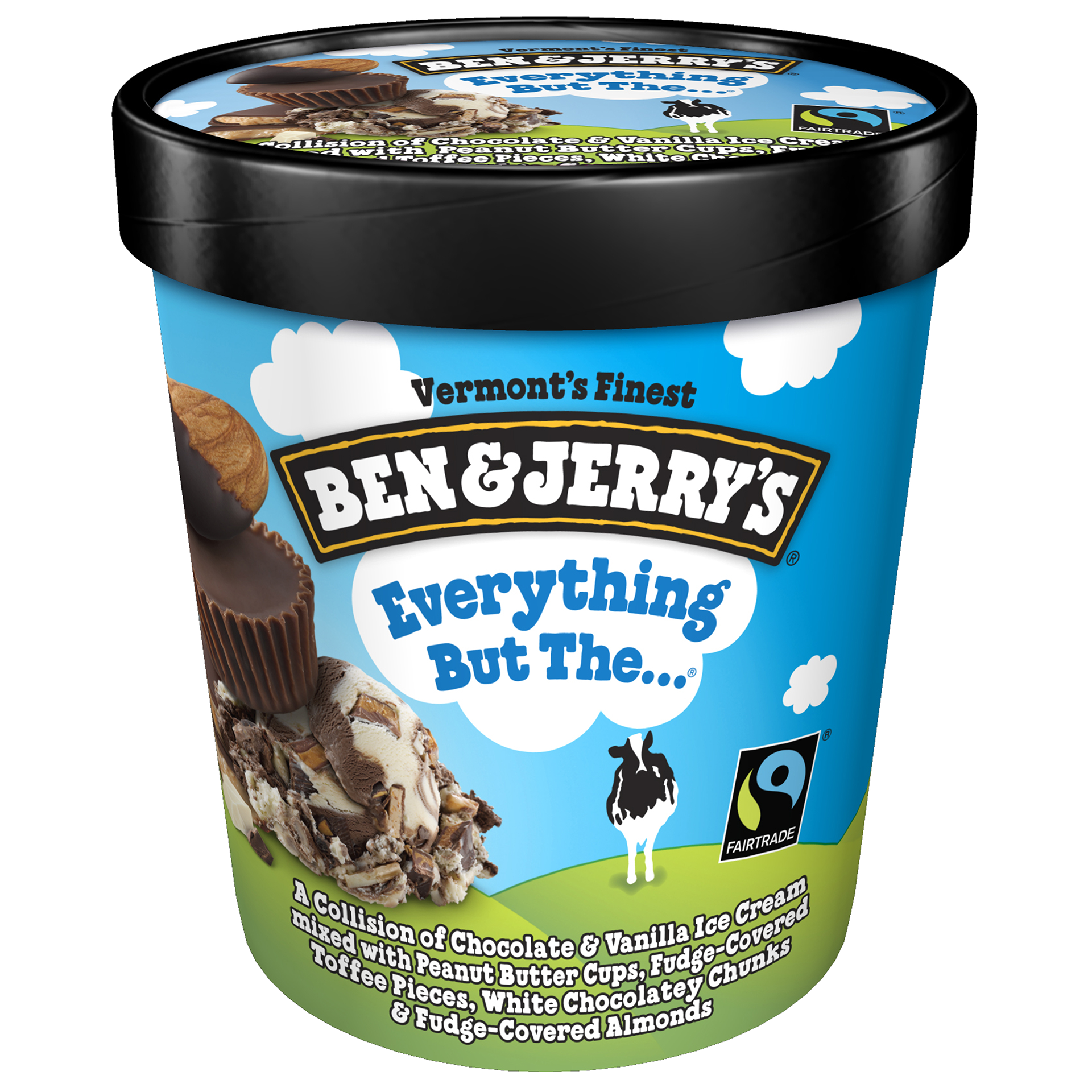
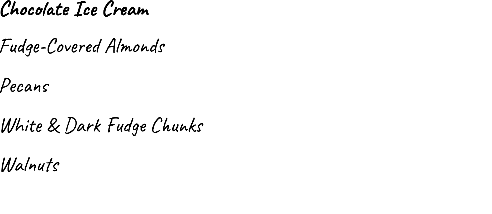
I began by developing a grid system and master pages that could be applied across all 20 pages. Flavor names were emphasized as primary headings, while supporting details—such as ice cream base and mix-ins—were organized into clear visual groupings to improve readability.

Information content and imagery was sourced from the official Ben & Jerry’s website. Because available assets varied from flavor to flavor, I adapted the layout to ensure consistency while working within those constraints.


Using master pages in Adobe InDesign, I standardized the placement of images, text, and icons to maintain alignment and uniformity. I also designed a set of custom icons to represent “value-led sourcing” attributes, including fair-trade ingredients, non-GMO, caring dairy and cage free eggs sourcing, and responsibly sourced packaging.


To strengthen brand recognition, I incorporated visual elements inspired by the brand’s packaging, including the signature cloud motif, which I used throughout the background to create a cohesive and playful atmosphere. I also selected a typeface from Google Fonts that captures a similar personality and expressive feel to the Ben & Jerry’s branding, helping maintain a consistent tone while working within accessible font options.

Solution
The final booklet presents a cohesive and scalable layout system that maintains consistency across all 20 pages while adapting to varying content. Each spread follows the same structure, allowing for clear communication of information while keeping the design visually engaging.
Typography, imagery, and iconography work together to create a unified presentation that reflects the brand’s identity. This project demonstrates my ability to design systematic layouts, manage multi-page documents, and adapt design solutions to real-world content limitations.