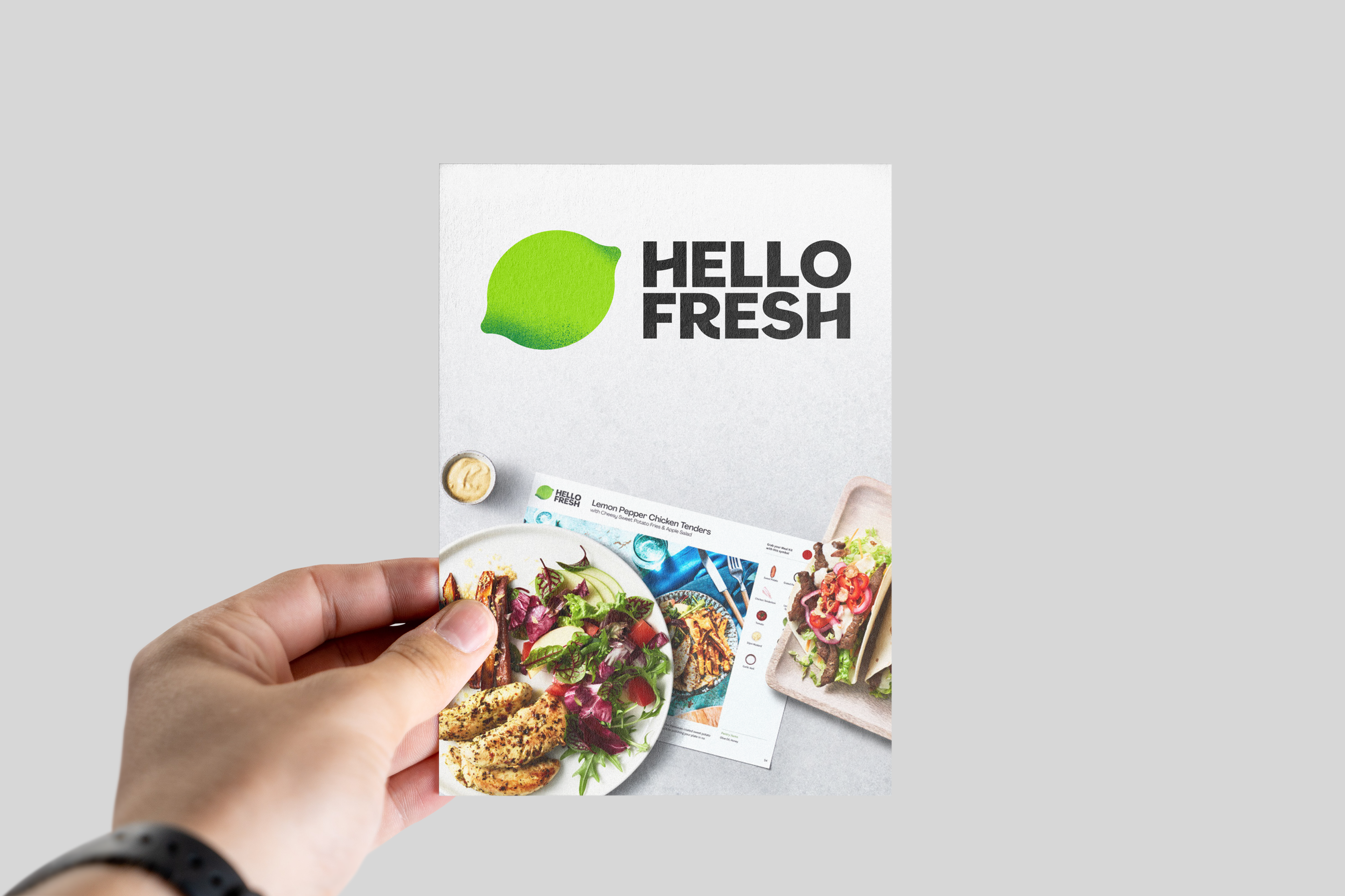
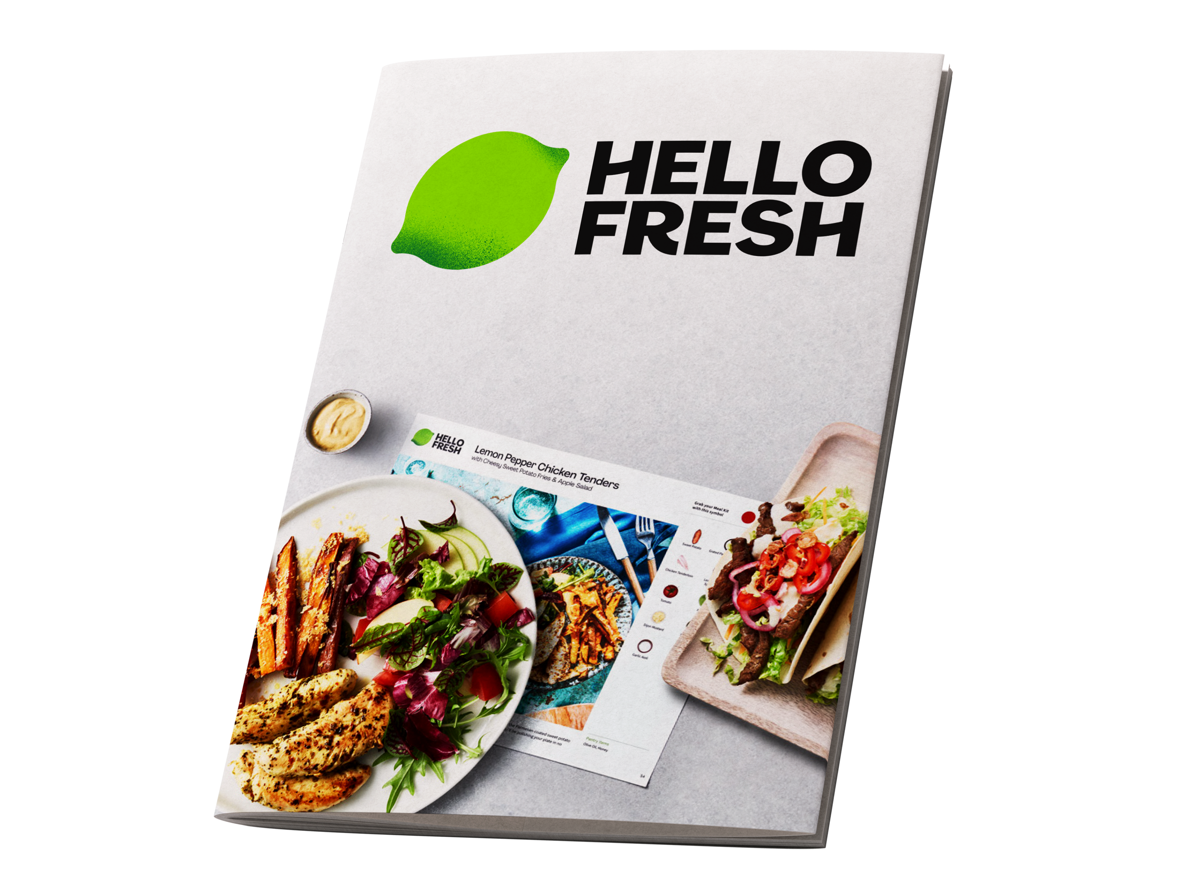
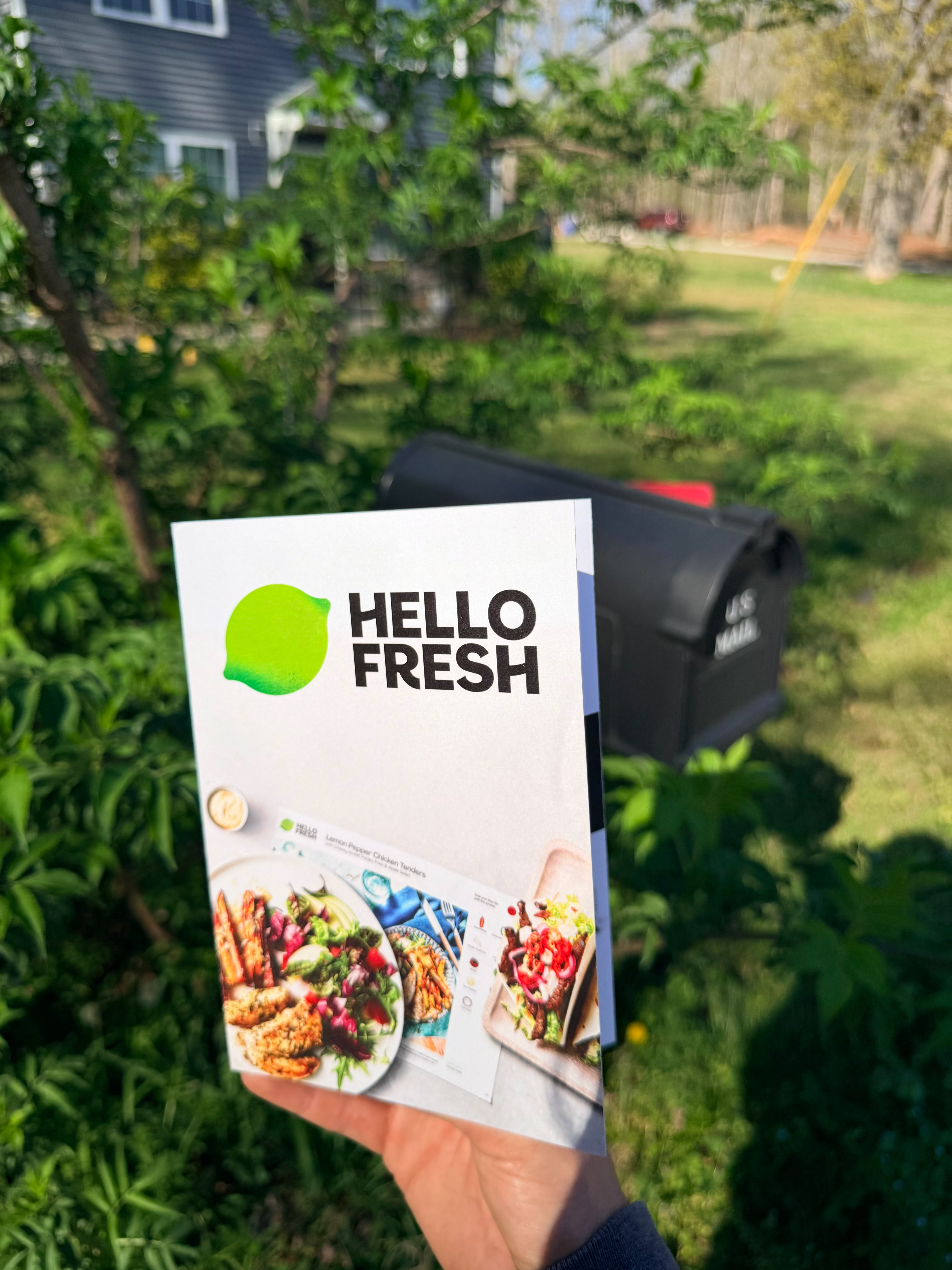
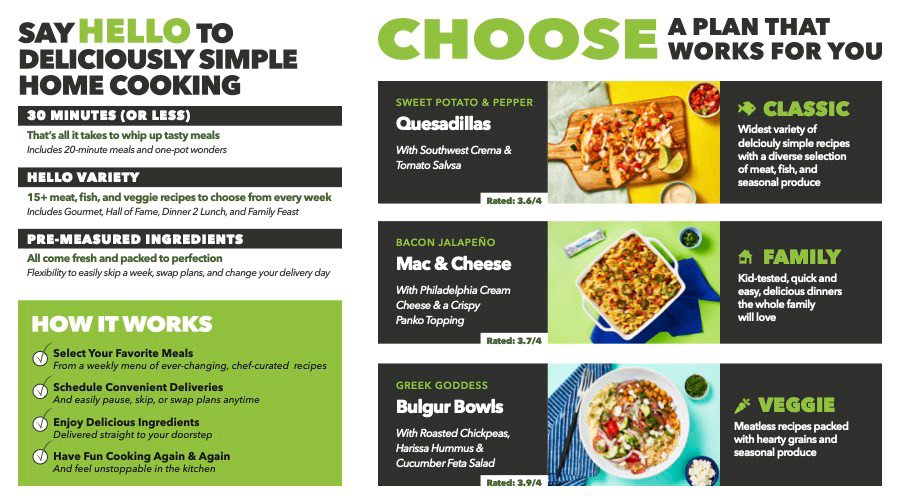
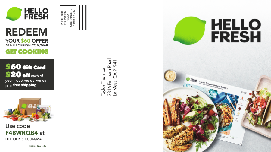
This typography project focuses on designing a direct mail piece using provided content and brand
assets. The primary objective was to create a clear visual hierarchy that effectively communicates
promotional information. Through the use of scale, contrast, and color, I emphasized key messaging while maintaining alignment with the brand’s identity. Imagery was selected to support the content and
enhance visual engagement.
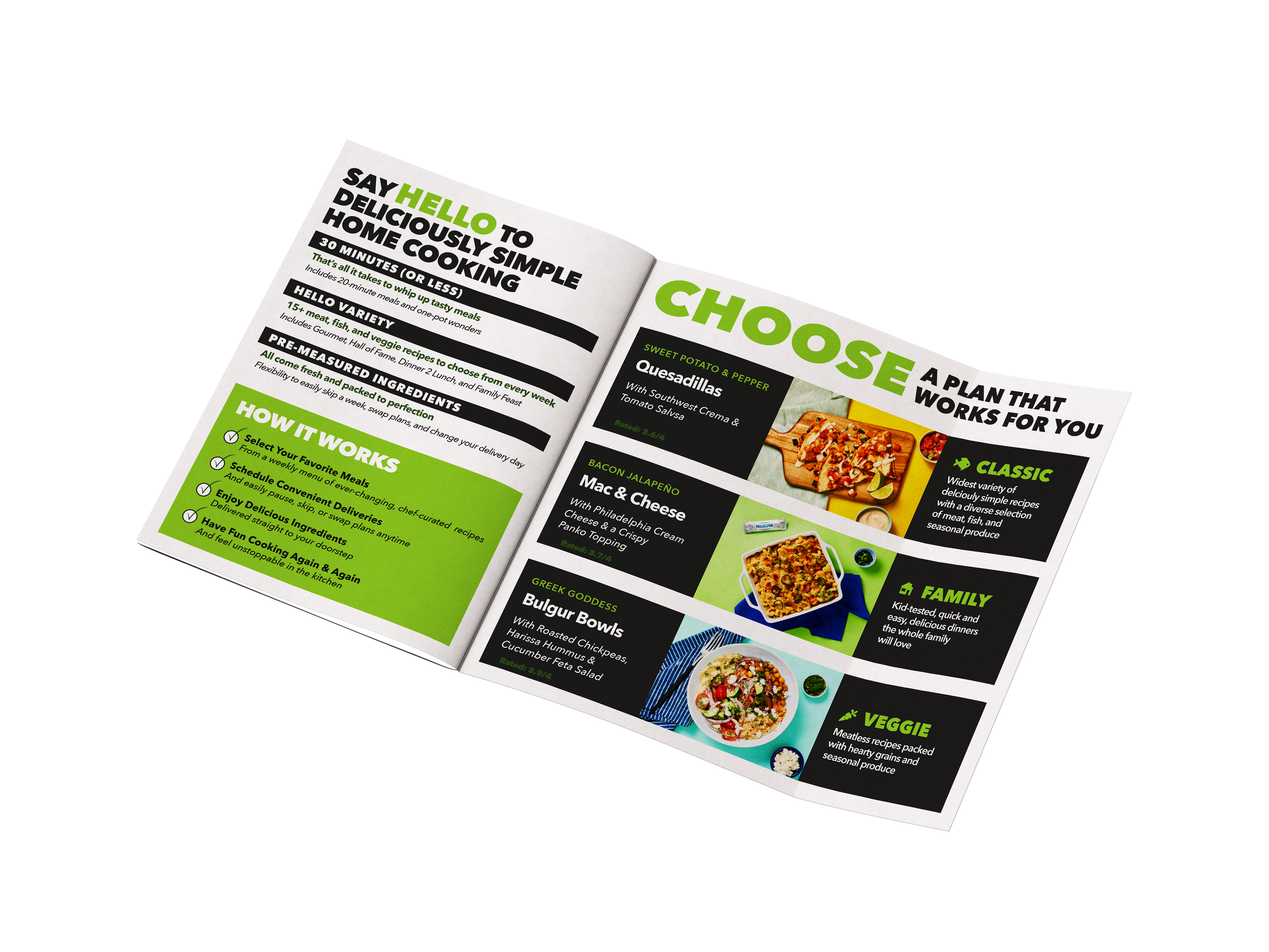
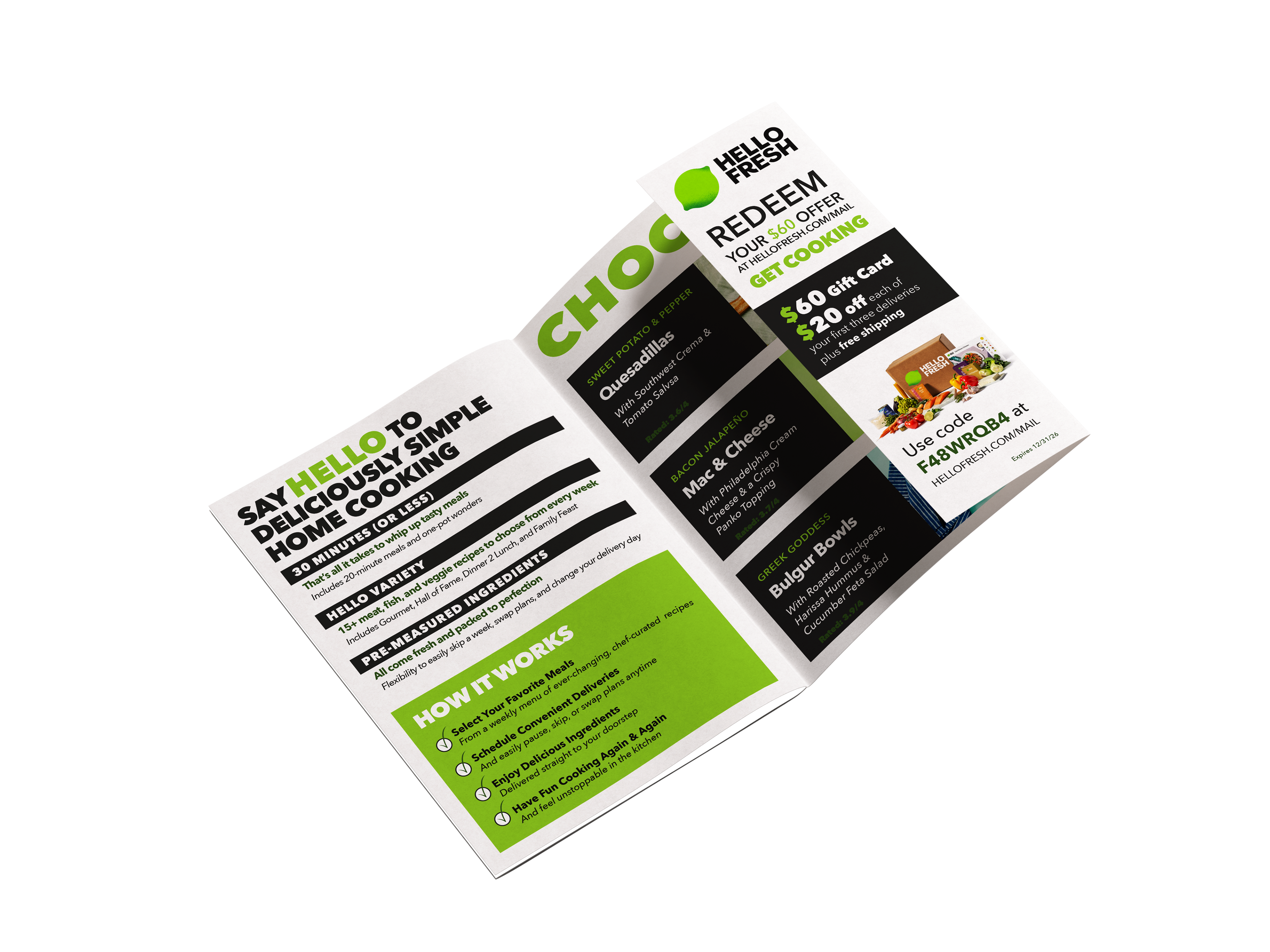