


Overview
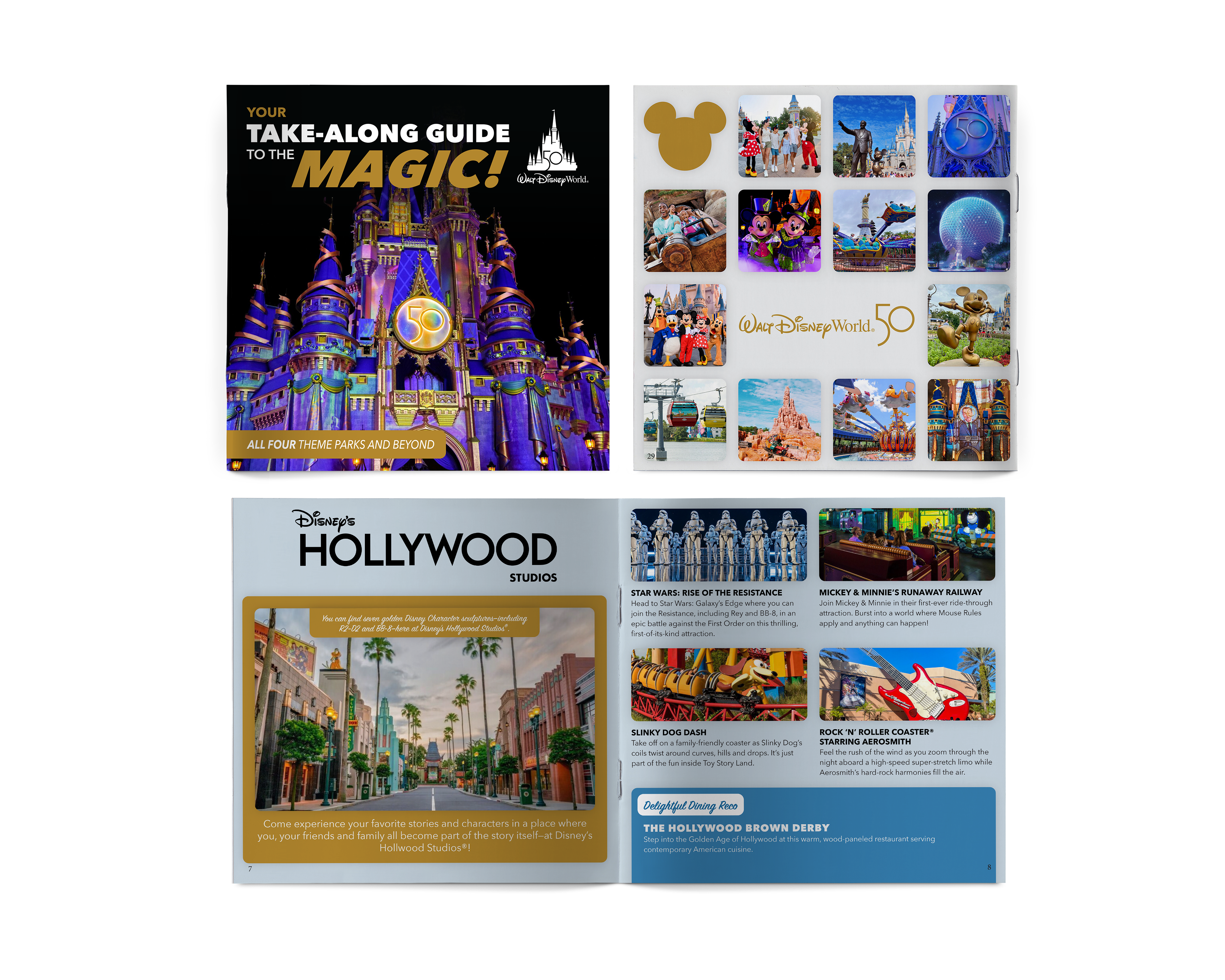
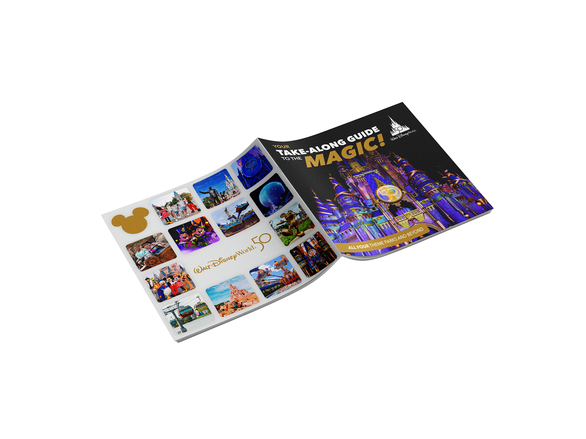
This project is a 29-page take-along guide designed for visitors attending Walt Disney World during its 50th anniversary celebration. The booklet serves as a comprehensive resource, combining park information, dining options, shopping directories, accommodations, transportation, and safety guidelines into a single, easy-to-use format.
The design needed to balance a large volume of information while maintaining a visually engaging and accessible reading experience for a broad audience.

The Challenge
The primary challenge was transforming dense, unstructured text into an organized and visually compelling layout. The original content lacked hierarchy, making it difficult to navigate and overwhelming for readers.
- Additionally, the booklet required:
- Consistent structure across 29 pages
- High-quality imagery for each section
- A balance between visual appeal and readability
- A design that felt both celebratory 50th anniversary) and functional
Design Strategy
To transform text-heavy content into an accessible guide, I developed a clear and consistent visual system. A strong typographic hierarchy—using bold headings, varied scale, and color—helps guide the reader and
allows for quick scanning of information.
allows for quick scanning of information.
Content was organized into structured sections that follow a visitor’s journey through Disney, making the booklet intuitive and easy to navigate. To manage the volume of text, I broke information into smaller sections, applied consistent spacing, and introduced callout boxes to highlight key details and important tips.
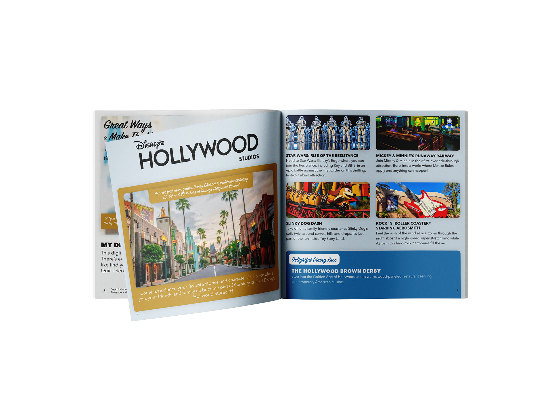
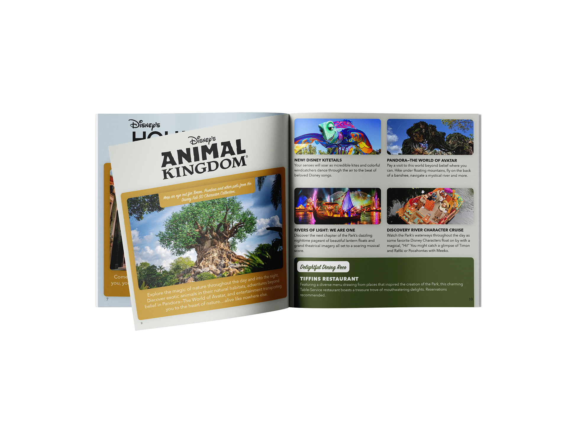
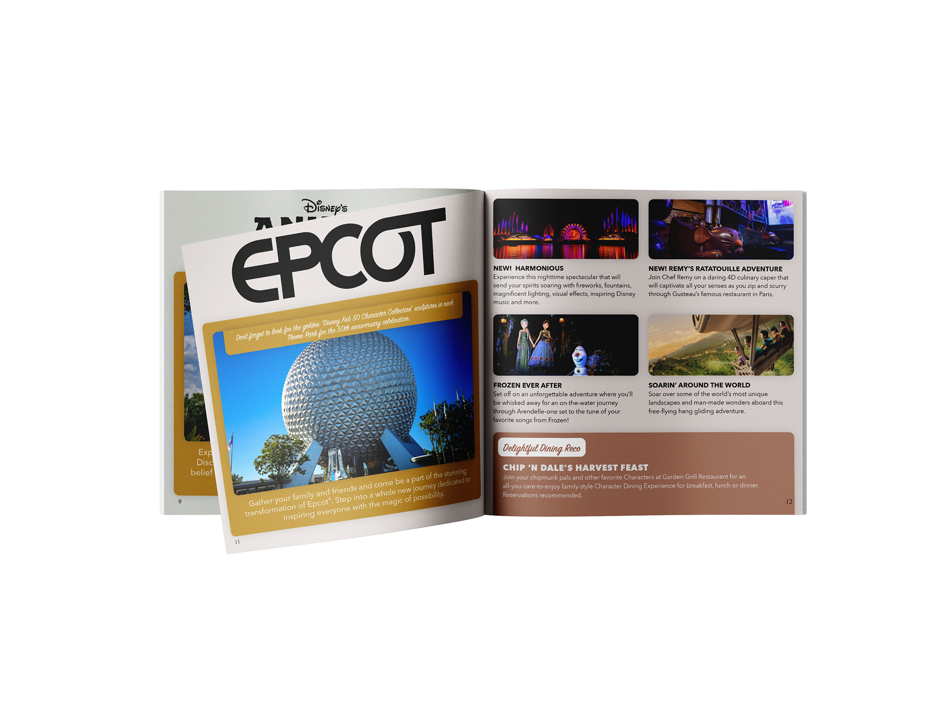
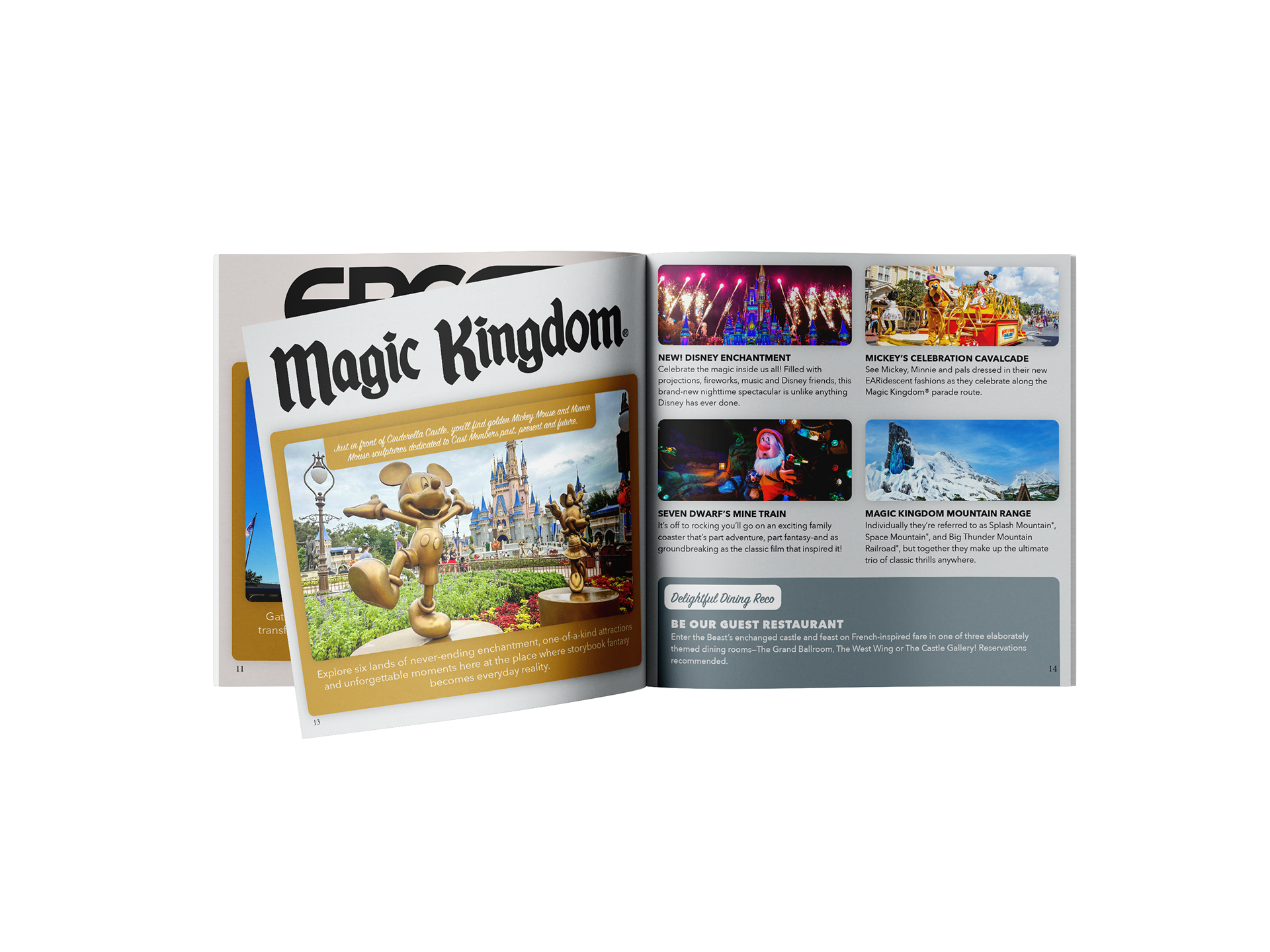
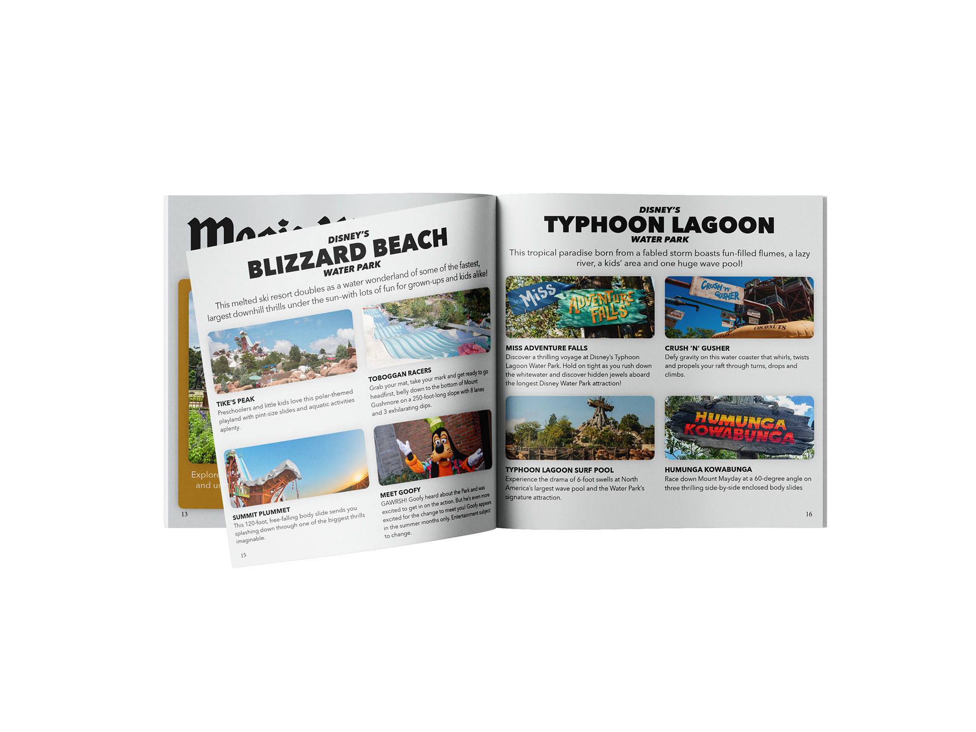
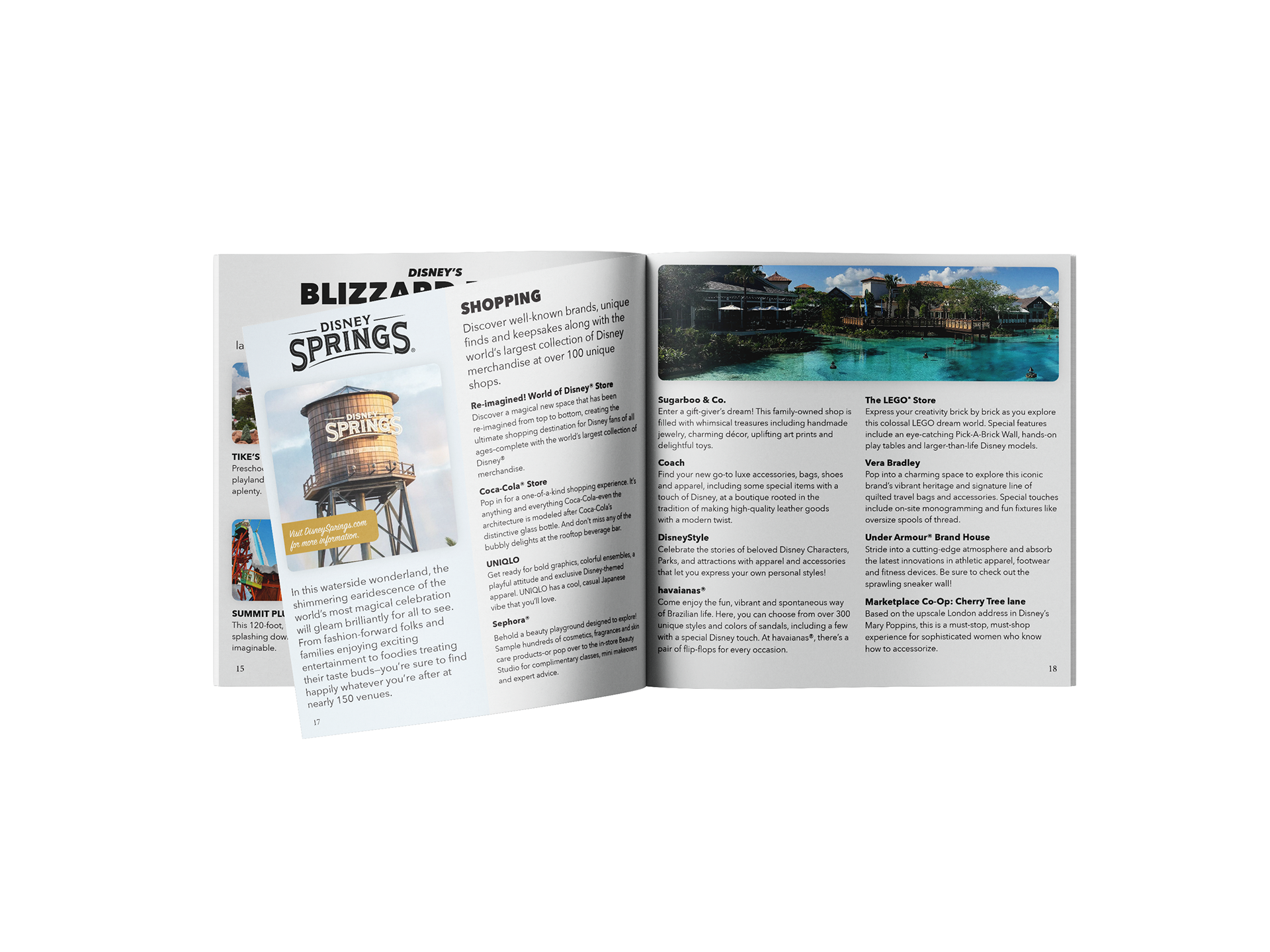
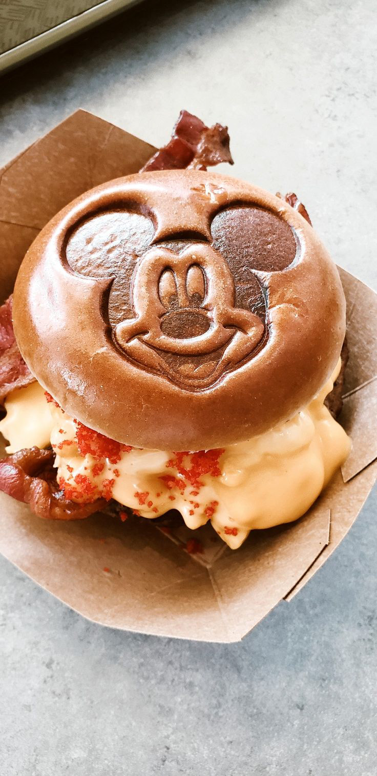
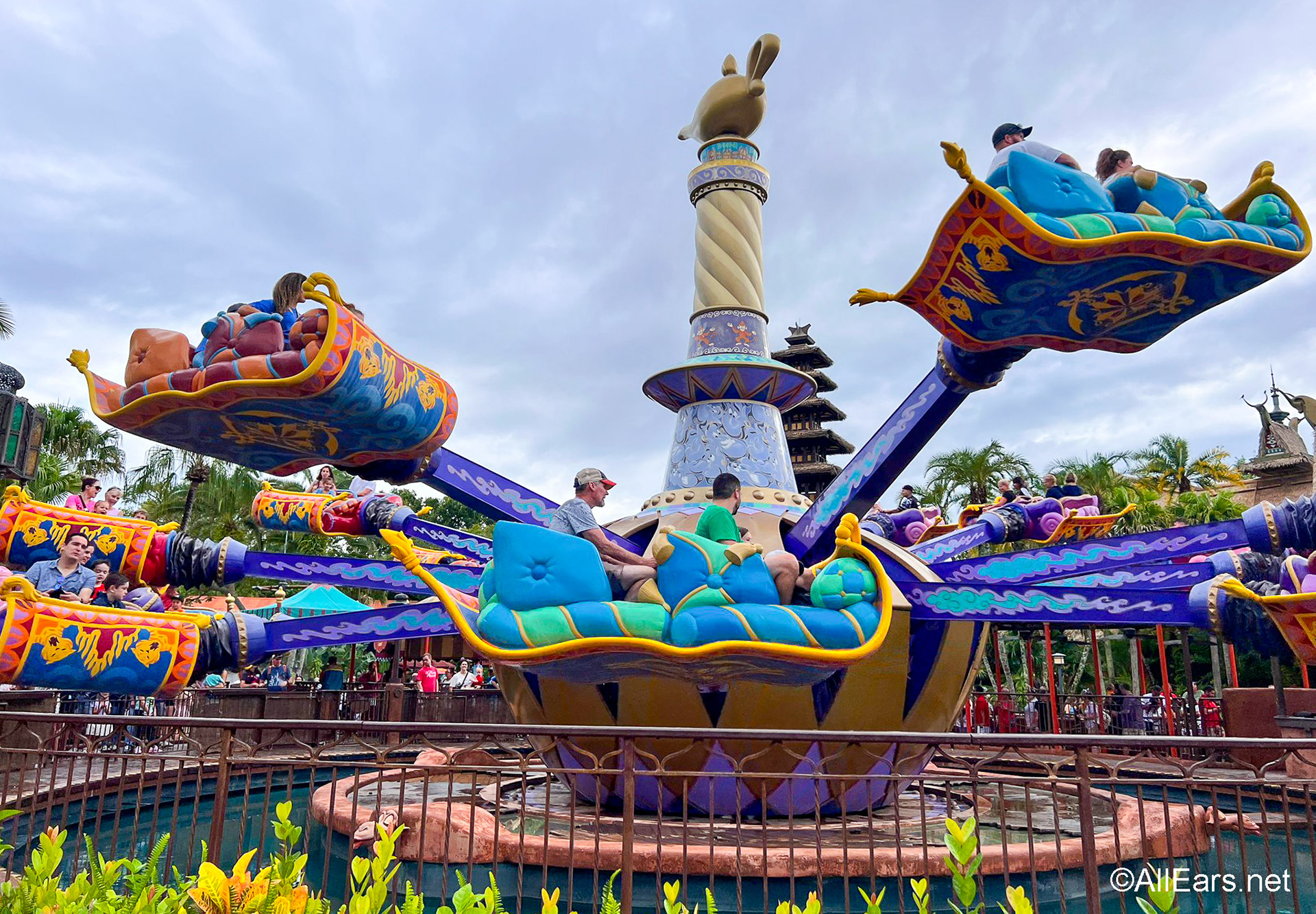
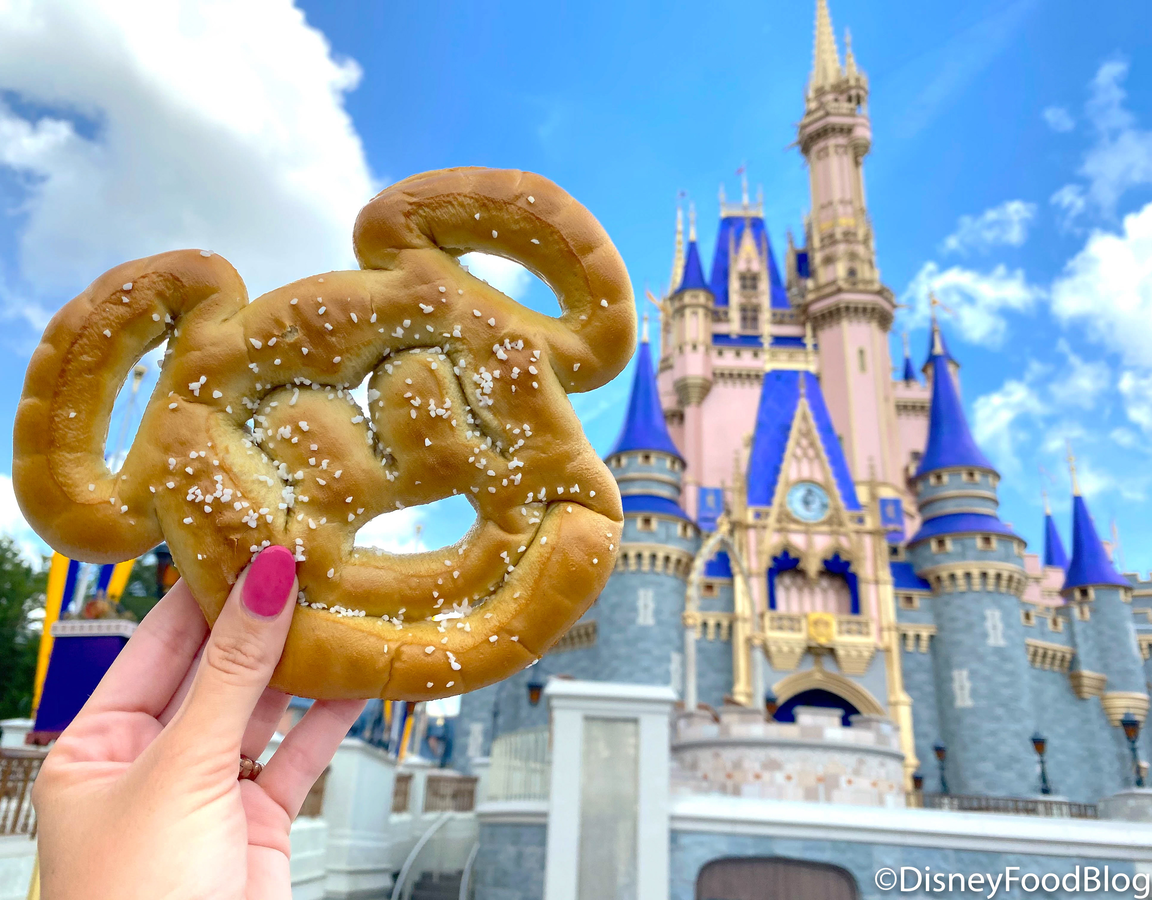
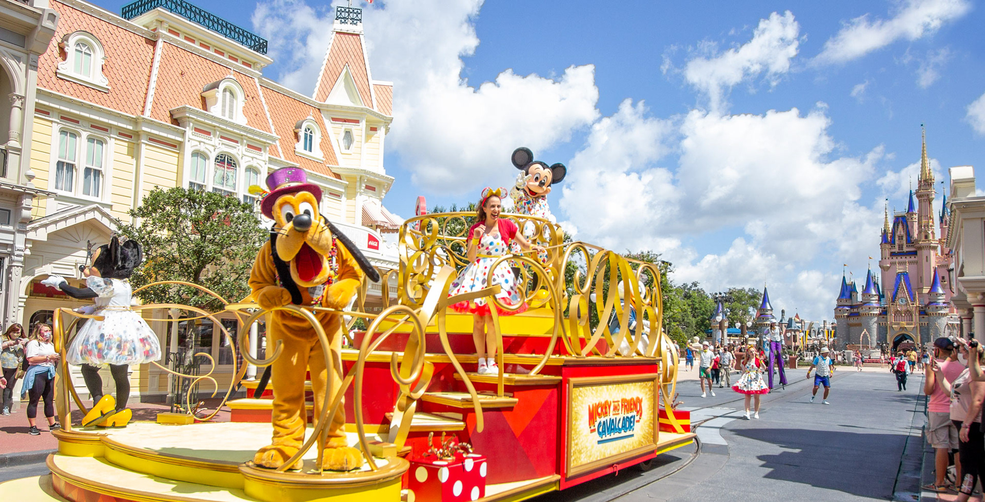
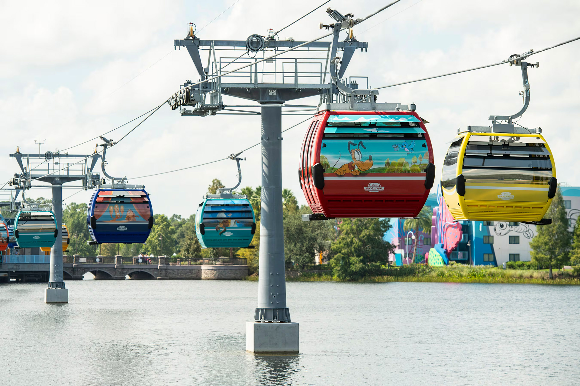
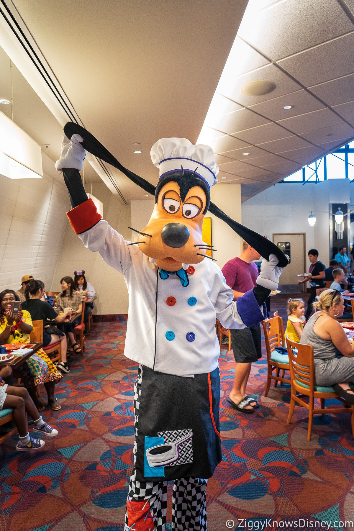
High-resolution imagery was carefully integrated throughout to support each section and reduce the visual weight of the text. Images were placed strategically to enhance the content without overwhelming it.
A consistent two column grid, paragraph styles, and alignment system were used across all 29 pages to
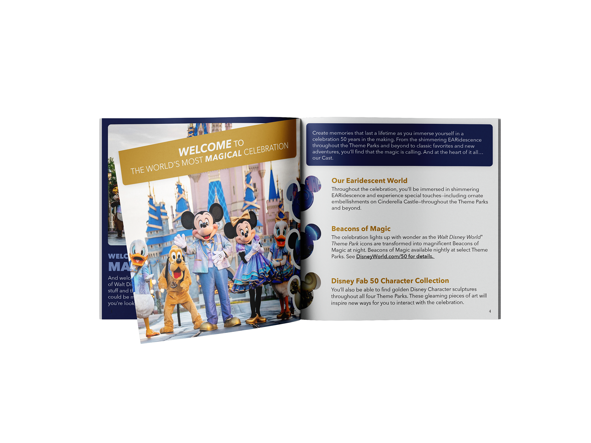
maintain cohesion and readability. The overall design uses a clean, minimal aesthetic, with subtle shadow effects and gold accents that reference Disney’s 50th anniversary while keeping the focus on clarity and usability.
maintain cohesion and readability. The overall design uses a clean, minimal aesthetic, with subtle shadow effects and gold accents that reference Disney’s 50th anniversary while keeping the focus on clarity and usability.
Outcome
The final booklet successfully transforms complex, text-heavy content into an organized, visually engaging guide. It allows users to easily navigate a wide range of information while maintaining a cohesive and enjoyable reading experience.
This project highlights strengths in:
- Editorial and information design
- Typography and hierarchy development
- Layout systems and consistency
- Balancing visual design with usability